Showing posts with label color. Show all posts

Saturday, April 11, 2020

OIL & ACRYLIC PAINTINGS, ABSTRACT & NON-OBJECTIVE

PAINTINGS NOW AVAILABLE ON ETSY

MY SHOP IS CALLED "GUHINP"

https://www.etsy.com/shop/guhinp?ref=search_shop_redirect 

Glossy acrylic, 9 x 12 x 2"


Oils, 9 x 12 1", "The Bridge"
Primary colors, very Mondrian-like. Oils. 9 x 12 x 1"

These paintings are all cradled, 

with good quality materials, and the design for each

does carry over the sides, so they are ready for hanging. 


Friday, October 9, 2015

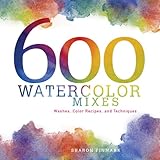
GIVEAWAY - BRAND NEW ART BOOK!

THIS GIVEAWAY IS NOW CLOSED.
It's easy to win this freebie!
The rules for the contest are simple. Just follow this blog and leave a comment below this post. A winner will be selected randomly and announced
at my very next post. Vivian Miller!
(Winner must then privately email me with his
 or her US postal address.)
Product Details
(This book has only been used once for review purposes!)
Excellent with acrylics mixing, too.
 
THANKS FOR FOLLOWING THIS ART BLOG!

Friday, August 16, 2013

IDEAS FOR COLOR SCHEMES

Half a dozen color harmonies for you to try!
I won't always use the "official" name for a hue, tint, or shade, but I hope you'll find several combinations that you like. What are YOUR favorite palettes?
                                                                                                                                       
color harmony, primaries
Cadmium yellow deep, cadmium
red light, navy blue
color scheme
Neutral gray, cadmium yellow medium,
& navy blue


colour, color
Burnt umber, burnt sienna, ivory, black.
color, colour
Cream with  light & medium red,
medium & dark gray.
color scheme
Cadmium red light, yellow green,
& a few true green accents.


colour, color
Bright aqua green, yellow oxide.

Sunday, September 16, 2012

How to Use Saturation or Intensity in a Color Scheme


Saturation
Also known as "intensity," saturation describes the strength of a color with respect to how pure it is. A color's saturation is the degree to which it is different from gray at any given lightness. For instance, colors that are quite grayish are fairly unsaturated compared to brighter, more vibrant colors. 
grayscale, grey scale, intense, color, dull, bright
Pure, bright yellow at left. Duller yellow (with gray, not black, in the gradient at right.
Pure, vivid color is not diluted by gray (or the color's complement). If you wish to tone down a bright, pure color and lower the saturation, add both black and white together (gray), or the color's opposite on the color wheel.
E.g., red is the complement of green, so it would de-saturate green paint (make an olive green, for example) to add some red paint to it. Or, to create a muted barn red, add a bit of green to the red paint!

Tip:
It's often advantageous to paint with a variety of intensities, to avoid a simplistic, "too sweet" effect.
                                                                                                                                   saturation, complement
                                                         A color's complement, if added to that color, will lower its intensity.


Sunday, August 26, 2012

THREE COLOR SCHEMES AND A CONTEST!

A Triadic color scheme is made up of three colors that are found an equal distance apart on the color wheel. The three primaries are a triad, as are the three secondaries. But don't stop there! In the example below, done by Geri Greenman, three intermediate colors have been used (red-orange, blue-violet, and yellow-green).
  
color harmony, colour, harmonious colors
Triads are equidistant on the color wheel.


Complementary color scheme, like the one below, uses the two colors that, uh, complement each other! They are pairs of colors found opposite each other on the color wheel. Below, the intermediate red-violet is complemented by yellow-green. 
color harmony, tutorial, art lesson
This example of color harmony was done in gouache.

 An artwork done in warm colors reminds us of fire and sunshine.
color harmony, color scheme, colour


Now for the contest portion of our program: If you're a follower of this blog, kindly leave a comment below this post if you wish to win a brand-new copy of the latest issue of Cloth Paper Scissors magazine! It's the September/October 2012 issue with my essay!


 mixed media


Saturday, August 18, 2012

Using Value in a Color Scheme

The Definition of Value
The value of a color is based on how light or dark it is. The easiest way to remember this is to picture a "grayscale," which runs from black to white with all the possible light, middle, and dark grays in between. The lighter the color, the higher its value. So a deep, royal blue is a lower value than a light, sky blue (a high value).
using values with color

Tip: An artist might find it helpful to use a variety of values in a single artwork, including white (or nearly white) and black (or nearly so).

Note: The scales below don't illustrate the lowest values (the colors with  lots of  black added).

high value, middle value, lower value, value scale
mixed media blogmixed media manic

Saturday, April 7, 2012

How to Use a Split Complementary Color Scheme…Lovely!


The split complementary scheme is a variation of the standard complementary scheme. It uses a color and the two colors adjacent to its complementary color. 


[triad of split complements]
Split-Complementary Color Scheme


An example of such three colors are yellow-orange, blue, and violet. Another split-complementary harmony is blue with red-orange and yellow-orange. The split complementary scheme offers more possibilities than the complementary scheme, and yet it has strong visual contrast for a striking effect.


[split complements forming a triad]


Tips:

1. Use a single warm color against a range of cool colors to put an emphasis on the warm color (red with blue-green and a greenish yellow-green, or orange with blue-violet and blue-green).

2.
You might wish to avoid using desaturated warm colors (e.g. brownish reds, brownish oranges, or dull yellows), because this may ruin the scheme.


Sunday, May 29, 2011

IMPRINTING YOUR OWN PAPERS TO USE IN COLLAGE

Both these techniques are quite simple to do, and the results can be startling!

Technique #1: Soak good watercolor paper in clean water, place it on a hard surface, and apply plenty of vivid, strong liquid watercolors. Lay absorbent textured materials into it. Examples include crocheted fabric, swirls of string, or open-weave burlap. Add more full-strength paint as desired. Place a sheet of glass on top and let dry overnight. If necessary, add a book on top of the glass to weigh down your creative sandwich!


Technique #2: Buy cheap colored tissue (the non-colorfast kind!) in strong colors, tear pieces as desired, and arrange them on damp, smooth watercolor paper. Spray with more water as needed. Then cover with the sheet of glass as before and let dry overnight.


Experiment with both these methods and do try variations, too! Much luck to you.
(I'll publish your successful attempts at either of these here, with you credited, of course, if you wish to send me good quality images.)

Sunday, January 30, 2011

Analogous Color Schemes Are Captivating!

Harmonious, related colors are always gorgeous together.


Take a good look at a 16-point color wheel. Analogous colors are those found immediately next to each other there. They look so pleasing together because they are a family of sorts.


Black, white, gray, and the neutrals such as beige and brown are not found on the color wheel,
but they certainly can be used in an artwork with analogous colors. Some analogous artworks
are done in all warm colors (reds, yellows, and oranges), while others, such as the 
sample below, use cool colors--anything  from violet to green. Or choose a combination
     of related warms and cools, an example of which is red, red-violet, violet, blue-violet, and blue. 


This still life was done with wax crayon and watercolors.


Here are some links to other posts about color schemes: http://mixedmediamanic.blogspot.com/2011/09/looking-for-great-color-scheme-try.html and

Thursday, December 9, 2010

Don't You Just Hate It When That Happens?

OK, this posting isn't all about mixed media art. And I'm not a hater. Really. But don't you just hate it when someone says "further" (for distance) when they should say "farther"? Maybe it doesn't bother you, and I understand that. But don't you just hate it when...
  1. The little skirt on the "Women" restroom sign is so small that the figure barely looks different from the figure on the men's room?
  2. Even in a retirement community, some of the popular "kids" still bully the others?
  3. Physicians and nurses, who should know better, are unhealthily obese? And they're YOUR doctor and his/her nurse?
  4. You forget a person's name or the name of an object, and these are words you've spoken a thousand times before?
  5. You've been standing at the end of a long line forever, only to have another customer walk up and nab first place at a newly-opened register?
  6. The sight of an older, unattractive man with a hot wife makes you think, "He's got money." ?
  7. The slow, SLOW driver ahead of you makes it through the yellow light but then the light turns red?
  8. The only birthday cards you get in the mail are belated ones?
  9. We never learn from the past; we just keep sending our boys off to war?
Lesson on Glue Resist


This colorful example is on dyed paper, but you can try it on printed papers, textbook pages, gift wrap, or whatever your creativity leads you to use.
When/if the paper is dry, simply squeeze out white craft glue, fabric glue, or any acrylic medium that dries clear. Dribbling tar gel works very well. Make organic lines and shapes with the glue, or create a geometric design, or write words and symbols.
Allow that to dry, and wash over the entire page with a thin coat of paint in a contrasting color.
Okay, so my finished page turned out hideously ( don't you just hate when that happens?) and I am not showing it here, but I'll bet yours is better!

Saturday, October 30, 2010

How to Mix a Dark Yellow: a Painting Tutorial

Yellow and black together make green. Many of you already know that, so I will keep this little tute brief.

Try deepening yellow with a mixture of burnt and raw umber instead, as shown at right in the photo above. This tip is courtesy of CPi, publishers of The Complete Photo Guide to Creative Painting, co-authored by yours truly!

Sunday, April 18, 2010

New Collage/Painting


This new work is acrylic paint, papers, and fibers on canvas.