Sunday, September 16, 2012

How to Use Saturation or Intensity in a Color Scheme


Saturation
Also known as "intensity," saturation describes the strength of a color with respect to how pure it is. A color's saturation is the degree to which it is different from gray at any given lightness. For instance, colors that are quite grayish are fairly unsaturated compared to brighter, more vibrant colors. 
grayscale, grey scale, intense, color, dull, bright
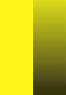
Pure, bright yellow at left. Duller yellow (with gray, not black, in the gradient at right.
Pure, vivid color is not diluted by gray (or the color's complement). If you wish to tone down a bright, pure color and lower the saturation, add both black and white together (gray), or the color's opposite on the color wheel.
E.g., red is the complement of green, so it would de-saturate green paint (make an olive green, for example) to add some red paint to it. Or, to create a muted barn red, add a bit of green to the red paint!

Tip:
It's often advantageous to paint with a variety of intensities, to avoid a simplistic, "too sweet" effect.
                                                                                                                                   saturation, complement
                                                         A color's complement, if added to that color, will lower its intensity.


No comments:

Post a Comment

Your kindness in leaving a message is greatly appreciated!