Showing posts with label art lesson. Show all posts

Saturday, October 12, 2019

A MONOCHROMATIC EXERCISE FOR ART TEACHERS & OTHERS

SQUEEZE-BOTTLE LINES WITH BLACK GESSO
 
Gesso has enough body and tooth to use as a barrier to hold in wet media, once it's dry. 
gesso, painting
I made my own black and gray gessos.
You can buy colored gesso or add acrylic color to white gesso. A clean squeeze bottle served me well for "drawing" the shapes. I also filled in some areas. Then I let the design dry overnight, before painting. See the first step above.
 
Then, the next day, I used diluted paint to complete the forms and shade parts of the background. 
painting, Guhin
This study was finished with fluid black acrylic and water.

The water and paint stayed within the confines of the slightly raised gesso lines. This exercise might be good for middle schoolers or beginners at the high school level. Art teachers could substitute watercolors at the painting stage if desired. Even pastels would be great! Students could create their own designs rather than relying on this "Pebble" motif, of course.
Guhin

Sunday, February 5, 2017

BACK TO THE DRAWING BOARD: BASIC FORM

Many Art I students or absolute beginners at the high school level require a great deal of practice when learning how to shade forms. That said, I’ve assigned to eighth graders the two exercises described here. And nearly every one of them enjoyed triumph with both! Performing the tasks required of them, my students, um, drew on their knowledge of essential art concepts.
It was fun to go loopy and bundle up, too!   
how-to, art+element
This might be too challenging for fifth or sixth graders.
GETTING STARTED   Before class, I had cut white drawing paper into 4.5” x 12” strips, one for everybody. Using transparent tape, I affixed one end of a paper strip to a drawing board to show the students how to start. Then I twisted or curved the strip toward the center and fastened that portion down, too. A final bump or curl, taped down at the paper’s end, makes the form even more interesting. I asked the class to create their own unique, "unboring" forms directly on their desks, but to leave work space on their desks for themselves!  

Before my demonstration on the board, we held a discussion on the element of form, with emphasis on its three-dimensionality and the use of light and dark to depict that. Then I drew an enlarged sketch (outlines only) of my bendy, taped-down example for everyone to see.

I passed around several finished works to exemplify our objective. My own shading on a whiteboard didn’t have the quality I wanted, so I used a piece of 18” x 24” white drawing paper and charcoal instead. Nattering away about values, gradations, and hills and valleys, I smeared charcoal from dark to light to transform my outline drawing into a form with mass. Then the kids began their own works with soft pencils, and I was able to walk the aisles to assist. I directed the artists to include the cast shadow on their desks, to ground their subject.
Guhin, art+blog
A form that takes up space!
I reminded the students to try to use their blackest blacks and their lightest grays—a full range of values. The class members were reminded of several fundamentals with the “wavy strip” lesson. ART TIP: Imaginative kids might poke a hole in their paper forms. I had one who even left a pencil in!

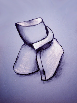
A BUNDLE OF FUN The second, related activity is best for another day, especially if class time is only 40 minutes or so. I had been given scraps of flexible foam rubber padding, so I shared a piece with each student. I instructed them to squeeze and squash their foam any way they wanted, and then tie a piece of string tightly around the bunched-up form.
tute, how-to, draw, form
Charcoal and white chalk on blue paper.
They could roll it, pinch it, and fold it any which way before tying it into an interesting form, but they should keep in mind that they would be drawing the bundle! If it was terribly complex, they could be quite challenged.

WE BEGAN very lightly with charcoal pencils on light blue construction paper.  But you could use any toned paper (not too dark), even brown wrapping paper! Following the contours of their bundles with their eyes, class members completed line drawings first.

Then we modeled the sketches with shading, just as we had done in pencil shading the drawings of the wavy paper strips. Again, including in their drawing the shadow cast on their desks was part of my message. “It helps to anchor the drawn form to the page.”
Guhin, MixedMediaManic
Ask a carpet-layer or re-upholsterer for foam scraps!
Lastly, here’s the reason for the toned paper: We added highlights anywhere the light would strike, especially the rounded tops of bulges. That finishing touch helped to illustrate the volume of the forms very well.
MATERIALS
  • White and toned drawing paper
  • Soft drawing pencils
  • Transparent tape
  •  Charcoal pencils
  • Upholstery foam scraps or carpet foam padding
  • String or rubber bands
  • White chalk or white pastels
LEARNING OBJECTIVES: to earn the importance of drawing what they see by using the elements of form and value, & to create a realistic work of art presenting the illusion of mass.

Sunday, December 25, 2016

MONTAGE & SCRAP PHOTOS & MORE

Duplicate prints and downright bad shots
 can be put to good use...I've said it before.
SURE, PHOTOSHOP CAN ACCOMPLISH ALL THESE
TECHNIQUES, BUT THE OLD-FASHIONED
WAY IS AWFULLY FUN.
In this first example, a large print served as the support (or background, if you will). Then I found other, smaller prints to cut up and arrange to make the work more interesting. Do try this, but only glue the pieces down when you're happy with the composition. I like the complementary colors together.

collage, montage
Good method for hiding the worst parts!
This next idea is the "more" mentioned in this post's title. My so-called example below is a straight photograph, with no manipulation or mixed-media. But it gave me an idea! Make your own "trellis" with thin chart tape, fine-line tape, or other colored tape! So easy, and yet you can be as creative as you wish.
how-to, tutorial
Copyright Paula Guhin
Our third photograph has been manipulated a great deal!
It's a weaving, of course, with yarns, wallpaper strips, and more.
I worked around the figure...she's not simply pasted on top!

 
I've featured other fun photo projects on this blog. Check out this photocopy fun page and this painted collage post. Also another painted collage page here. AND 3 photomontages, fun and cool.
Happy New Year, everyone!

Wednesday, October 19, 2016

MASKED MONOPRINTS & WAXY TRANSFERS

TWO BRIGHT IDEAS TO TRY! 
MASKING with flat paper cut-outs enhances this
first technique, monoprinting. I usually roll
water-based printing ink onto a sheet of
Plexiglas and draw or scrape designs directly
on that surface. I used rubber tips and many
other scraping tools to make lines, shapes,
and patterns.

TIP: Work quickly so the ink doesn't get too
dry.

 Then add the paper masking shapes, which                            
you could prepare ahead of time if you know
what your theme or motif is.
 
Lay the paper shapes on top of the still-wet
ink, wherever more white is to be preserved.
Place the sheet of printing paper onto the
inked, designed surface. Press all over the
back with the flat of your hand. Peel the
Guhin, copyrighted, blog
I used oil pastels on this monoprint.
print off, let dry.
While the black-and-white
prints have graphic appeal,
they’re even more delightful
when partly colored. Use
dry media when the print is
thoroughly dry: colored
pencils or pastels (oil or chalk).
However, if you printed with oil-based ink or acrylics,
the print is not water-soluble and you can colorize
with inks or watercolors!

Guhin, art, blog, tute
This page spread appears in the November issue of Arts & Activities
Magazine, which any visual arts educator should have!

IMAGE TRANSFER with waxed paper is exciting. 
Computer images that are graphic and black &            
white work best on the waxed paper.                                 
 
The final print will be reversed.

First, the computer image must be no larger
than 8.5” x 11.”  Cut both smooth watercolor
paper and waxed paper to that size, too.
Then dampen the watercolor paper with
water and wipe it off, because too much
water will make the print blur terribly.
Set that aside but don't let dry too much.
 
To prevent wrinkles or jamming the printer,
scotch tape the waxed paper smoothly to a                                                
sheet of printer paper at the top. 
how-to, tute, tutorial
Image transfer on waxed paper.
Or use repositional adhesive spray at the top end.
Either side of the waxed paper works.

Feed the sandwich into the printer and print.
 
TIP: Definitely use an inkjet printer.

Don’t be alarmed by the “faint” print you get
on the waxed paper…it’s supposed to look like
that! Gently lay it ink-side down onto the pre-
dampened watercolor paper. Holding the
waxed paper firmly down so it doesn’t move,
press all over with your hand. Then carefully
Guhin, art+blog
Watercolors on sealed print.
lift the waxed paper. It will still have ink,
so be careful not to drag it.

These prints are water soluble,
so colorize with dry media only.
Or spray the print with
clear acrylic when dry,
let that dry too,
then add watercolors or inks.
 
Both techniques are easy and fun to do,
so I hope you enjoy them.


Saturday, August 27, 2016

BRUSHO REALLY BRINGS IT!

I've been a big fan of Brusho Colours (can you tell they're from Great Britain?) for a long time. They're watercolor ink powders or crystals, and very versatile!
For the painting today, I used heavy-weight white Yupo. Yupo is good for mixed media, pen and ink, acrylics, even pencil! Today's example was first done with alcohol inks, which Yupo seems MADE for!  

how-to, art+blog
STEP 1: Leave some lighter areas too!

Alcohol inks dilute with, um, alcohol! And on Yupo you can blot them with a rag or blend in other alcohol ink colors while they're still wet. But on absorbent paper you can't do that as easily, and they do dry quickly.

 
STEP 2: Acrylic gloss medium (or satin, even matte medium!) is either brushed on in places or squeezed from a plastic bottle. ART TIP: Work quickly so the medium does not dry.
 
STEP 3: While the clearish acrylic medium is still wet, sprinkle Brusho crystals over it in colors that work with your scheme. ARTIST'S TIP: These powerful powders will leave a stain on wet fingers, for awhile at least!
art, blog, how-to
You can even add water wherever the powder needs blending.
This is such a super-fun technique! Easy, and great results for all ages!


Saturday, May 21, 2016

PHOTO ARTISTRY: NOT JUST FOR PHOTOGRAPHERS!

As some of you may know, I'm keen on photography,
and also big on using up all my old photo prints that
are less than perfect.
In fact, my book Adventures in Photo Artistry is almost all about creating artworks from them. Artists can also find numerous tips on composition, such as the rule of thirds illustrated below.
composition
I've created many, many collage projects and montages too, plus numerous transparency activities. The piece shown below is one of the latter, with selective removal of a portion of the image done by hand.
scribble, art+blog
 
Guhin, blog
 Similarly, this transparency (above) has been drawn on with markers. If you do this, choose an image with white (meaning clear) areas so your marks will show up well.

Here's another post, dibble-dabble-scribble, using transparencies, again with some selective removal of the image.
And yet another! mixed-media-with-transparencies 

Saturday, August 22, 2015

WHITE TEMPERA RESIST

I've done many posts about various kinds of resists (glue, soap, wax, and more). This is one of my favorites!
The process appears in four photographed steps in a book I co-authored, Painting with Mixed Media. 
Guhin, painting
It's really a beautiful book.
First, use heavy white paper. A smooth, thick watercolor paper is wonderful for this.
If you wish to sketch your design first, do so very lightly in pencil.
 
Next, use thick white tempera paint, applied wherever you wish the finished work to be white. (It's a challenge at times to only paint in lines and shapes in reverse, so to speak, since most of us are so used to working with darker lines first. But stick to highlights and lighter areas with the white tempera.)
 
Thirdly (is that a word?!), when the white tempera is dry, cover the entire piece with a coat of permanent black India ink. Apply it gently with a wide brush and let dry.
 
Lay the paper into a sink of cold water and gently sponge it until the tempera paint lifts off, taking the black ink with it. You're left with a black and white design reminiscent of a woodcut, perhaps.
 
This example was enhanced with washes of watercolors, but you can use inks, thinned acrylic paint, or pastels to add color if desired. 
Guhin, resist, tempera, project
Simple, but I loved the process!
Guhin


Saturday, July 4, 2015

LOOSEN UP! ABSTRACTION TECHNIQUES

Do you want to work less realistically and more abstractly? Letting go takes practice. Open up with these ideas.

Base an artwork on a piece of one of your own sketches. Here's one of mine, below, which I cut into sections.
how-to, tutorialdrawing, Guhin
On pastels paper, using water-soluble oil pastels, I made the quick abstraction below based on just one of the pieces.
tute, techniqe
Here's another way to find abstract compositions: Cut out just a small portion of a magazine photo, as I did below. 

pastels, how-toThen I played with soft pastels
(Rembrandt is an excellent brand).
Be loose...you're not trying to be exact!
Guhin
I'm not crazy about the red in the center!


art+blog, mixed-media

Saturday, June 27, 2015

FOLDS IN THE FLAG…FOR INDEPENDENCE DAY!

In honor of July fourth, coming up soon, here's a study
in colored pencil using a flag or drapery.
This drawing project is quite challenging. Berol Prismacolor pencils are best.
tutorial, drawing, colored+pencil
The student flipped 2 corners of the printed fabric.
The following colors are suggested:
  • Black
  • White
  • Gray
  • Tuscan red
  • Crimson red
  • Scarlet lake red
  • Blue-violet
  • Ultramarine
  • Indigo blue          
I like to pin the fabric folds into place on a large sheet of cardboard, since the entire activity takes a good amount of time to complete.
 
I always ask my students to use a large sheet of brown wrapping paper so they can work big! But you could work on white or toned paper if you wish.

Sketch very lightly in pencil first, blocking in the shapes and the folds.

TIP - Begin with the blue field first if you wish. One reason to save the white stripes for last is that you can protect the other colors with sheets of paper. Otherwise your reds and blues will bleed or smear into the white.
Guhin, how-to, tute
Remember to add shading under the flag where needed, too!
TIP - Shadowed areas around folds require a touch of blue, not just black or gray!

Blending is key: An art gum eraser and a waxy blending pencil (made by Berol) will help lots. If your students are less experienced &/or younger, practice with solid fabric instead of stripes, as shown below. 
drawing, colored+pencil, how-to
White fabric with blue and violet shadows.


Friday, May 1, 2015

Complementary Color Schemes are Great!

Complementary colors are our focus with this post. This acrylic painting, shown below, uses the complements of red and green.
Yellow and violet are lovely together, as are blues and oranges. Notice the pastel pink below rather than real red. And notice the many shades and tints of green!

complements, color+scheme
Are you busy planting or potting for Spring?
Do you have a color wheel handy? Pairs of complements are found directly opposite each other on the color wheel.
Often it's wise to use one color predominantly and its complement as an accent.
I especially like red-violet with yellow-green...sooo pretty. Blue-violet is another fave, with touches of yellow-orange.

Try your own artwork with a complementary color scheme!

Sunday, April 19, 2015

HOW TO ALTER MAGAZINE PAPERS WITH CITRASOLV

Why buy collage papers when you can make your own, really cool
papers for mixed-media creations? CitraSolv is a natural
cleaning product that dissolves the inks in some magazine papers.

Guhin, art+blog, lesson
I tried to avoid obscuring the figure completely.
Needed Supplies:
CitraSolv (the concentrate)
National Geographic magazines as old as the 60s! I also had luck with Bazaar.
Smock (optional)
Latex gloves
Foam brushes
Q-Tips or a rag (optional)
Container for product (glass or plastic)
Stencils (optional)
Clothespins and a line


Here’s How:
Work outside if possible, as the product has a very strong scent.

Prep a surface to work on. You will want an area to dry your papers,
so you might set up a string clothesline on which to clip your pages.
NOTE: Use care that the product should not get into your eyes or mouth!

1. Prepare a work area. Set up your drying area as well. Put on your gloves. Pour some CitraSolv into a glass or plastic tub (margarine containers are good) and use a foam brush to spread CitraSolv liberally on the colorful pages in the magazine, working from the back to the front of the publication. Smear each page around a little to soften the dyes!

2. When you are done, let the magazine “cook” for about 5 minutes. Check it by opening a page in the middle to see if it looks good yet When you like the results, cut or tear the pages out and hang them up to dry. Both sides will be altered and it may be hard to choose which is better!

NOTE: Be sure that the image you altered is unrecognizable. If it cooked long enough, it will be nothing like the original. This will avoid any copyright issues…don’t use it in your art if you can still tell what it is and where it was from.


My favorite technique for removing ink is to use a stencil as a mask over the page, wiping the exposed parts with a CitraSolv-doused rag. 

tute, Guhin, how-to, art+lesson
Using a stencil is easy with CitraSolv!


how-to, Guhin, art+lesson
This one took a stencil well.


how-to, tute, Guhin, art+blog
Here I masked with rubber cement!
I also suggest trying a mask of either rubber cement or acrylic medium. When either has dried
(though rubber cement remains sticky), THEN use the CitraSolv with a rag! You can rub off the sticky rubber cement later!
When you have finished papers you like, I recommend spraying your page with a workable matte fixative to stabilize the ink and reduce smudging.


Thursday, April 9, 2015

TRANSPARENCIES: DIBBLE, DABBLE, SCRIBBLE!

I make my own transparencies from original photos and my inkjet printer. There are more than a few posts on this blog explaining how to use transparencies artistically in a number of easy ways:
  1. MAKE COOL LIGHTCATCHERS
  2. PLACE COLORED PAPER BEHIND and another HERE TOO!
  3. PAINT THE "CLEAR" AREAS BEHIND
  4. DOODLE IN THE CLEARED SPACES
Today's message is twofold: Another "drawing in the cleared space" with several ways to proceed with an inkjet transparency!

FIRST UP TODAY, FUN WITH FUNKY LINES
Rubbing with a damp cloth is a far easier method of removing inkjet ink from the rough side of a transparency. I've used a scratch tool in the past, and that's great for precision and sharp edges. But if you have a large area to remove, you can even dip the inkjet transparency briefly in water for easier removal! (Of course results may vary.)
With the photo below, I rubbed large areas away and then used both wide and thin markers to doodle in the cleared spaces.

mixed-media, art+blog
Kids could have a blast with this project!