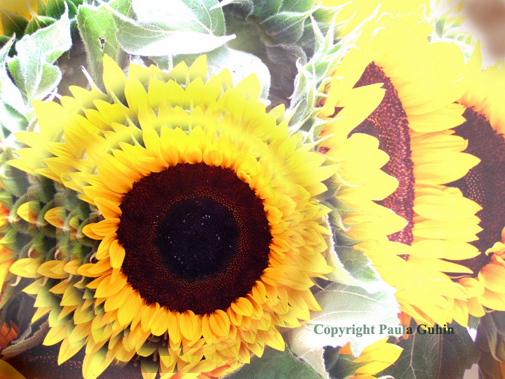
What Lies Beneath
Take your photographs to a completely new level—several, in
fact. Build a layer cake, of sorts, with…um, layers! Besides working with
digital images, you can even do this project with successively sized
photocopies or enlargements of the same image, creating a collage.
Take your photographs to a completely new level—several, in
fact. Build a layer cake, of sorts, with…um, layers! Besides working with
digital images, you can even do this project with successively sized
photocopies or enlargements of the same image, creating a collage.
 |
Photo copyright P. Guhin  |
To Begin
It’s important to select a borderless photograph with
graphic impact. Close-ups work well, as do longer shots with simple, empty
backgrounds. A cluttered-up photo is too “busy” for this activity.
Lay It On
On a background of your choice (even a full page-spread of
the featured photo itself), paste a copy of the image, scaled a bit small er. Lose the rectangular format if you wish—the
image can be square, oval, circular, even free-form! Adjust the brightness or
tone of this second layer as needed, for better demarcation from the background.
Balance
Combine the elements of a layout in a way that adds a sense
of stability. Equilibrium can be achieved with symmetry or asymmetry.
Symmetrical balance
refers to a formal design in which the two halves of the piece mirror each
other.
Build It Up
Repeat the process of pasting in another layer of the same
image, scaled small er than the
previous one. If you wish to create an asymmetrical design, move this copy up,
down, or to one side.
If you’re offsetting consecutively small er
images, you can either rotate each slightly or maintain a level appearance,
whichever you prefer.
Variety and Contrast
Be sure all your layers show up well. Desaturate every other
layer (if the original image is in color), or adjust color balance differently
in each layer. One cool option is to work from lighter to darker layers or the
opposite. The possibilities are endless!
Finally, if you wish, add text and any other embellishments in such a way
that they do not interfere with the visual impact of your striking design.


No comments:
Post a Comment
Your kindness in leaving a message is greatly appreciated!